
2024 ABAA Mentorship Program
Latest Catalogs of Rare Books
2024 National Collegiate Book Collecting Contest
Brown Bag Series: Treasure Hunt Stories
The Latest Members of the ABAA
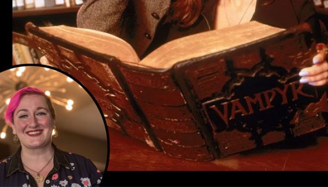
Brown Bag Series: Allie Alvis
The ABAA Gender Equity Initiative is proud to announce the fourth year of the ABAA Mentorship Program, designed to further the ABAA's mission to promote ethical standards and professionalism in the antiquarian book trade, encourage the collecting and preservation of rare and antiquarian books and related materials, and facilitate collegial relations within the trade. Goals � Further the mission of t... [ more about 2024 ABAA Mentorship Program]
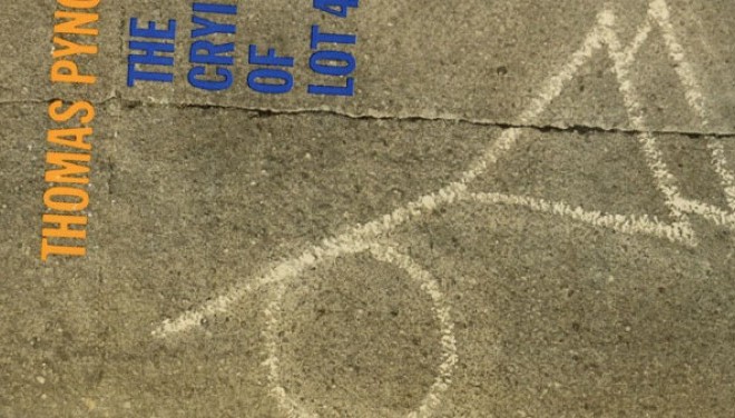
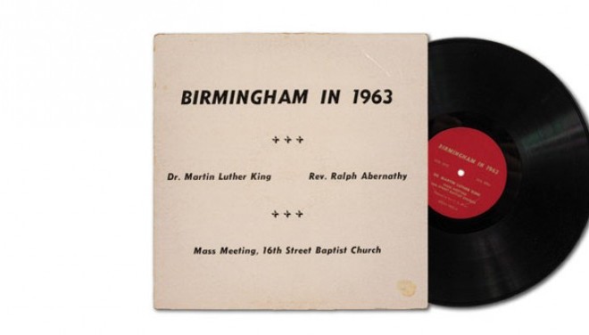
The ABAA New York International Antiquarian Book Fair returns to the Park Avenue Armory in New York City from April 4-7, 2024, for its 64th Edition. Here are some of the highlights that exhibitors will be offering at this year's Fair! Decorative Wood Panel with State Seal of Delaware. 7-1/2” x 10” x 1-1/2”; 2-1/2” metal connecting plate with screws on each side; dowl opening from top to botto... [ more about New York Book Fair Highlights]
Browse the latest catalogs, newsletters, and e-lists of rare books, fine bindings, incunabula, print ephemera, and much more from the members of the ABAA below. (Also includes podcasts, blog posts, and other digital formats.) *New* indicates any catalogs brought to our attention since mid-February 2024. AARDVARK BOOKS/EZRA TISHMAN BOOK APPRAISALS March Exit Stage Left List *New* March Lion List (Marc... [ more about Latest Catalogs of Rare Books]
